CONCEPT STUDY · 2019
Audible Exploration
A concept study exploring on Audible as part of a week-long project at General Assembly.
- Role
- Product Designer
- Timeline
- 1 week
- Team
- Independent study
- Responsibilities
- Concept exploration
- Design thinking
- Prototyping
A one-week concept study: A short exercise in design thinking — framing a question, exploring widely, and converging on a point of view.
The Problem
Users who listen to audiobooks don't enjoy the benefits of dog-earing pages, highlighting excerpts or leaving notes on their favorite pages...
Audiobooks are the fastest growing audio segment on mobile and this leaves a lot to be desired from the audio experience on mobile devices.
Design goal
To implement a feature for users to add bookmarks to their audio experience.
Has anyone thought of this?
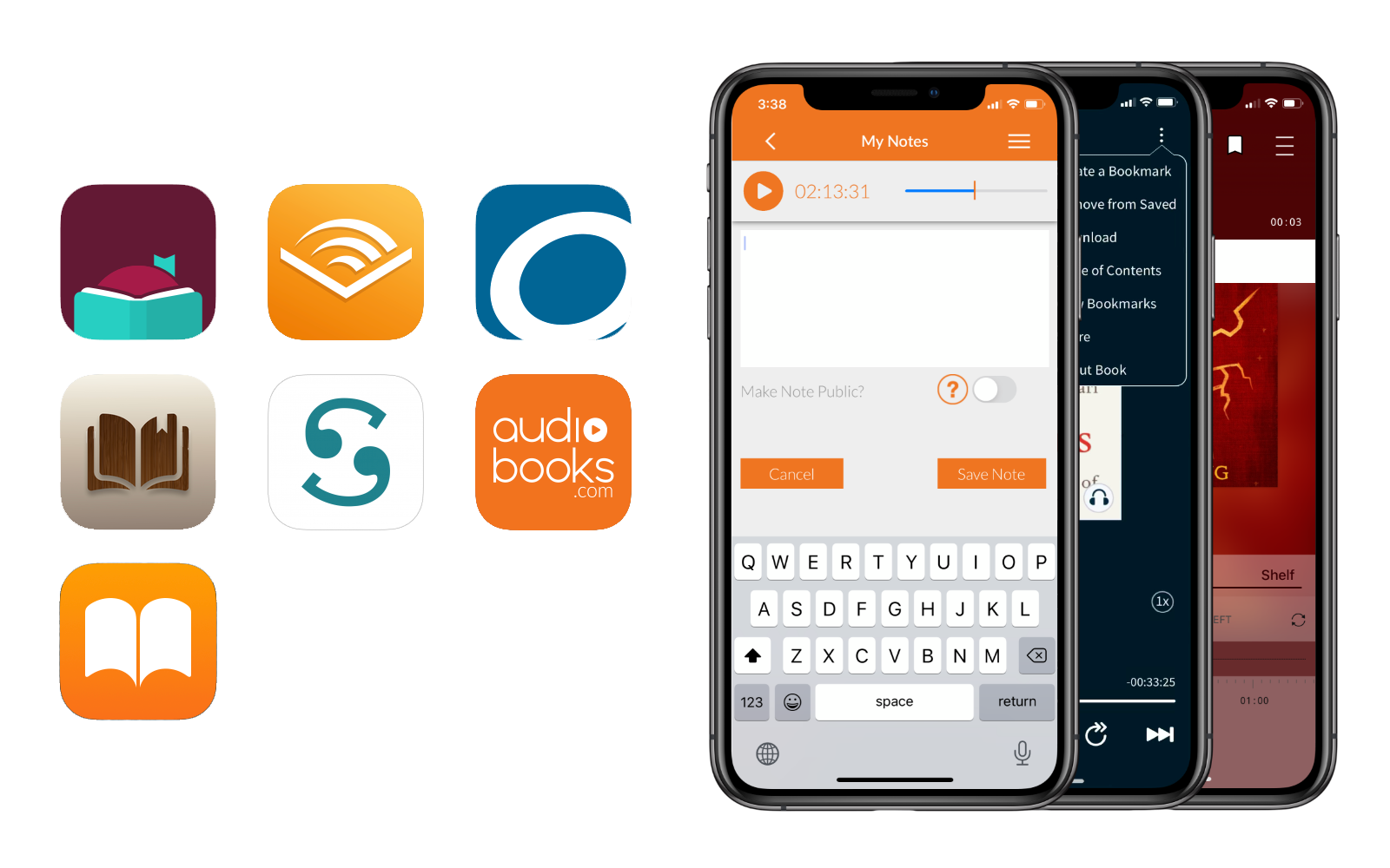
There are many audiobook apps in the market. I started by searching the most popular to the lesser-known apps (Libby, Audible, My Books, Audiobooks, OverDrive, Books and Scribd). I have studied the differences among these apps and found that most of them allow the user to highlight/add notes, however, they were not intuitive.
How useful do users find this feature?
After interviewing users who are both reading books and listening to audiobooks, I learned that 80% of the users have been using the Audible app. And none of that 80% knew that such a feature existed. I have decided to focus on finding out why this feature was overlooked and how this feature can be improved on Audible app that is popular and widely used.
Why is Audible's + Clip feature underperforming?
With a better understanding of where the problem is, and with the majority of testers using Audible, I decided to focus on why this feature was overlooked or was found unintuitive to use in Audible.
User pain points
None of the Audible users knew what + Clip did. I asked them to try out this feature and gave the specific tasks to perform; i.e. to add a note to a track and to bookmark 45 secs of another section of the book they're listening to.
“I am not sure where my notes are saved!”
“I wish there was a hierarchy in the 'saved notes' page. I am not sure what I am looking at.”
Top insights
- The icon is vague.
- No clear differentiation between 'Preview' and 'Add Note'.
- Adding notes and selecting a portion of the audio are done in separate windows, hence confusing.
- Not clear where the notes are saved at.
- It's not easy to find notes in Clips & Bookmarks page due to lack of hierarchy in context.
How might we enhance the performance of this feature?
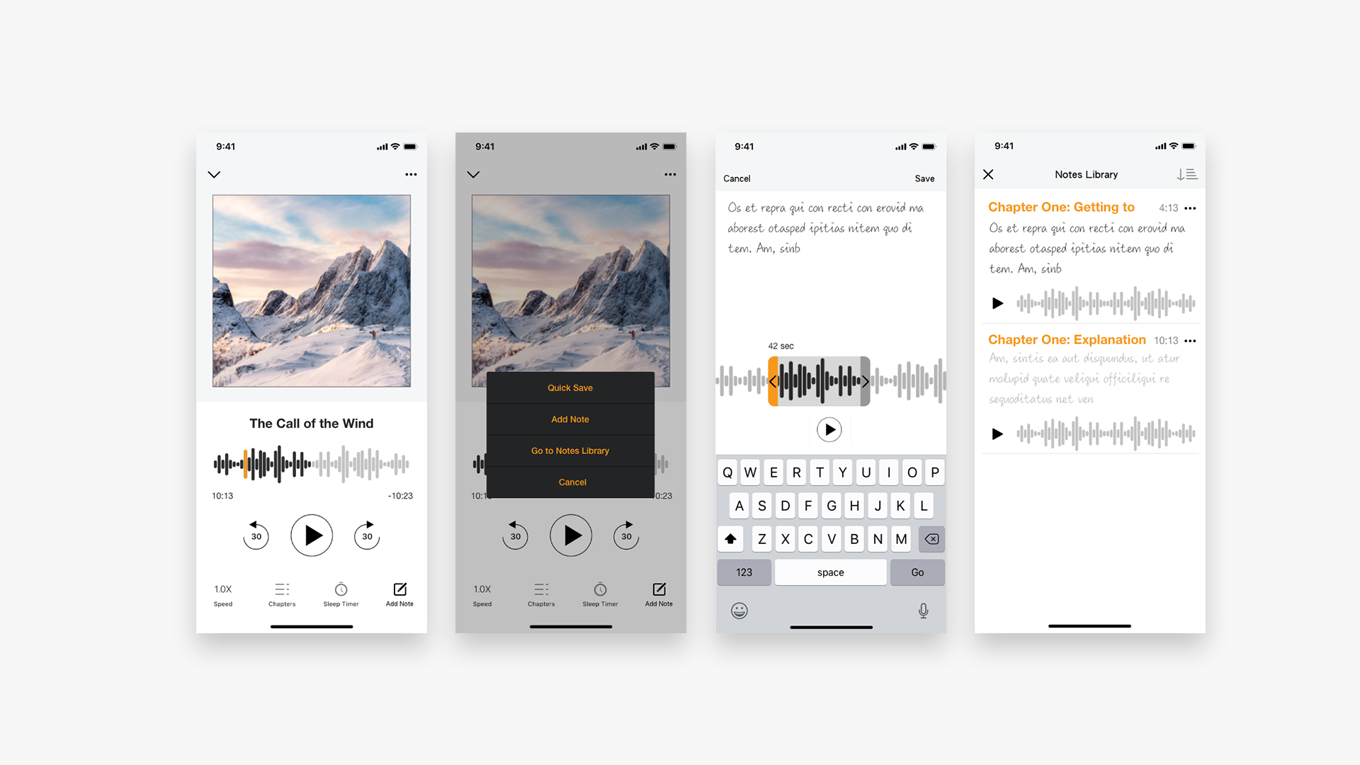
These mockups went through couple of iterations based on the feedback from the users. The icon was changed to a more familiar one and changed the name + Clip to Notes. Used a hand-written font for the Notes to make it feel more personal. Moved the 'Saved notes' from the 'More' tab to the Notes tab to be found easier. Reorganized the Notes Library
Where should the 'saved notes' be stored?
To find the best location for the saved notes, a click test (using usabilityhub.com) was conducted. And results showed that users were expecting to find them at the Notes tab.
Icon
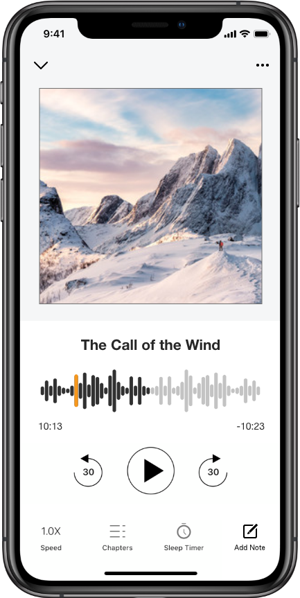
The icon was changed from + Clip to a more familiar paper-and-pen icon. It was easy for users to understand what this does.
Adding notes
By clicking the Add Note, the window with a voice bar will appear. Users can slide it to the right or left as well as adjusting the highlighted section by dragging the handles.
Users can also jot down their note and save; all in one place.
Quick Save
This allows the users to quickly mark a section without adding notes. However, if they choose to, they can add notes later by clicking on the same icon and going to the library.
Notes Library
To access saved notes/highlights, users can simply click on the same icon, then go to Notes Library to view/edit.

Takeaways
Usability test with high fidelity mockup revealed that the navigation made easier and there was no confusion.
While we helped users better understand what that feature is by changing the icon, a contextual tutorial could be added to educate users about this feature and simply walk them through the steps to add notes/highlights.
Time was limited, however, I'd like to explore alternative ways to categorize and organize the 'Saved Notes' and to explore voice command/assistant feature.