Startup · 2020
FiveSense
0-1 product design at an early-stage startup — owning everything from research and brand to shipped mobile experiences.
- Role
- Founding Product Designer
- Timeline
- 16 months
- Team
- 2x Founders 6x Engineering 1x Design
- Responsibilities
- End-to-end product design
- Brand & design system
- User research
- Rapid iteration
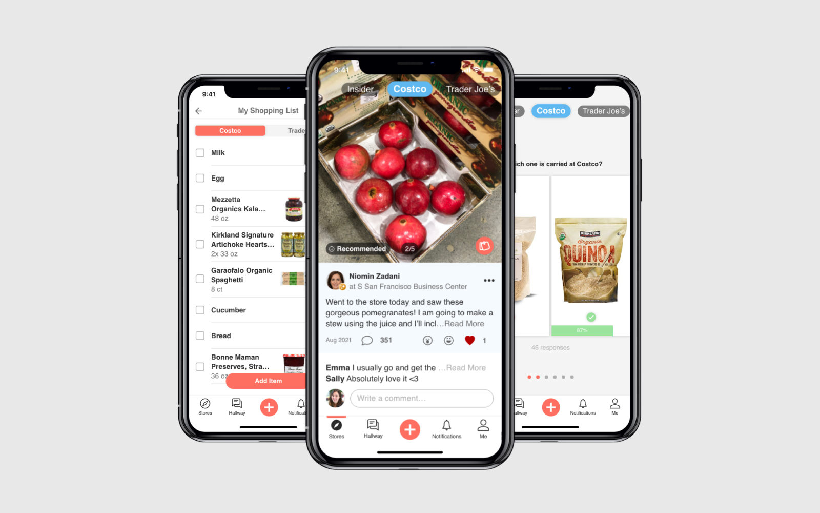
Five Sense was a vertical social media platform for everyday shopping, where users could discover and share authentic product recommendations. As the founding product designer, I led the end-to-end design from concept to MVP. The app launched in July 2021, onboarded approximately 850 early users, and was later paused before a broader public release as the startup shifted priorities.
The Problem
Shopping is transactional and searched based on current eCommerce platforms
As grocery retailers are going online, consumers find shopping less engaging on their online platforms. They have to use each platform separately and it's just boring!
Research
Users behavior today
Customers already go to general-purpose media such as Facebook to find like-minded people, to share their experiences, to learn and to have fun.
Fans of big retailers (i.e. Costco, Target and Trader Joe's, etc) all have created their own Facebook groups. The size of these groups range from a few thousand members to more than a million!
Key insights
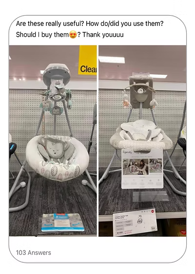
By observing the content users share in those groups, I've identified 5 major categories:
New item recommendation
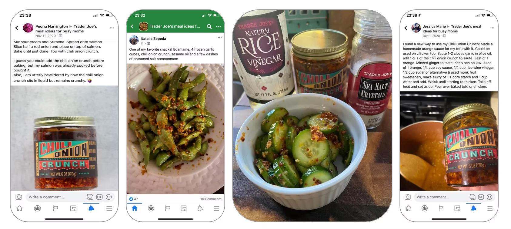
Common interests
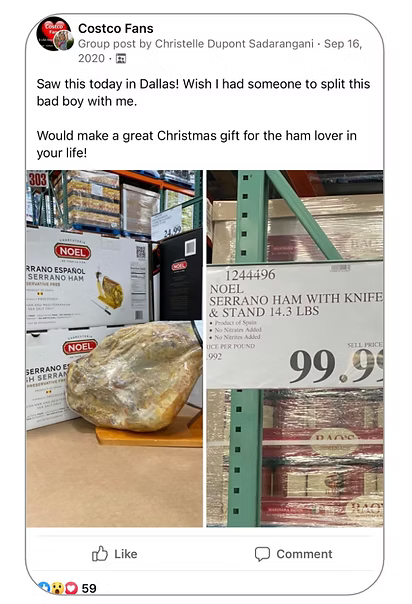
Co-purchasing
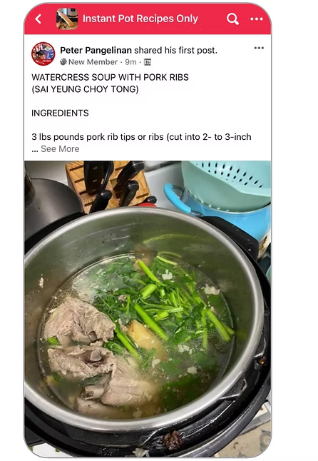
Complimentary item recommendations
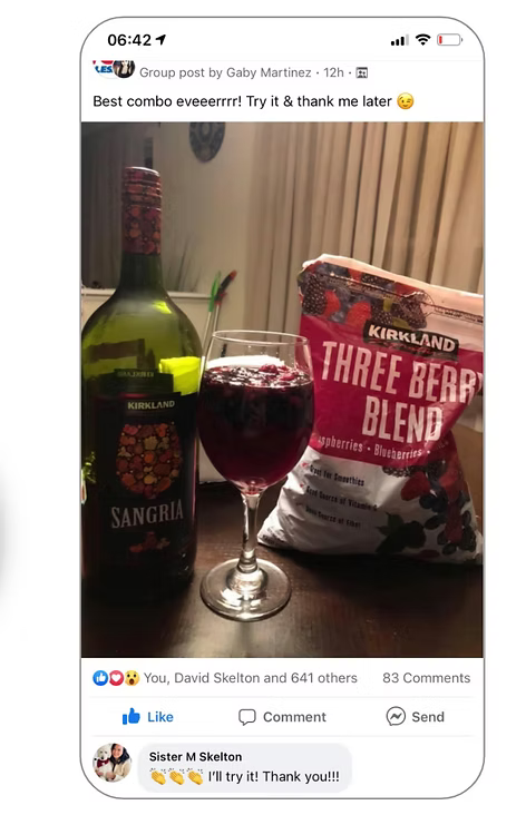
Expert opinion
Niomin Zadani

- Age
- 42
- Location
- Lives in the Bay Area
- Family
- Married, with a daughter and a son
- Education
- BFA
- Employment
- Stay-at-home mom
Story
The research insights converged into a single person we could design for — a stand-in for the millions of community-group shoppers we observed.
When she wakes up in the morning, she prepares lunch bags for her husband and two kids. She's always looking for efficient ways to shop and cook. She's part of online social groups to get inspiration for her everyday living needs.
It's important for her to make educated decisions fast and get honest reviews from a trusted community — while keeping it fun.
Behavior
- Loves shopping at Costco, Trader Joe's and Target
- Cooks healthy meals at home almost every day
- Takes her son to soccer every weekend
- Enjoys helping others and sharing her findings and DIY hacks with the community
Goals & Needs
- Always on the lookout for the best products that make everyday living easier
- Needs to be efficient when preparing food for her family on busy days
- Always looking to try new recipes
The Solution
A community-based shopping platform that is social, informative and fun. Which we like to call Mall of the Future.
Similar to a physical mall, it is social and it has entertainment as well as enabling product discovery.
Competition
There are many social and eCommerce platforms in the market which we looked into. Apps such as Facebook and Instagram have high interaction rates and are all about discovery, whereas other apps such as Amazon or Instacart are search based with high transaction rates. There is no platform that puts communities and products both at the center.
Exploration
It took rounds of sketches and reviews to build the lo-fi wireframes. Then I made changes in various aspects of the product and tested the design objectives with users.
Before moving into high fidelity, I mapped the entire product as a single tree: onboarding flows into the home screen, which branches into the five core areas — Explore, Challenges, New Post, Notifications and Me. Keeping every feature one tap from home made the app feel like a place to wander, not a tool to operate.
High-Fidelity Prototypes
Creating a platform that is social, entertaining and has utility.
Similar to a physical shopping mall, users have access to their favorite stores to discover new products or ask for help, and to share their own experiences. They can engage in conversations in the Hallway as if they're walking through the mall and its shops.
The product catalog makes it easy to get specific product info and add items to the Shopping List. And to have a little fun, users can answer Quiz questions daily and compete with others.
At Home: Consumption
While browsing the feed, she comes across a baby monitor that someone recommended and adds it to her shopping list. Reviewing the comments, she decides to get the complementary item as well.
At Store: Conversion
She goes to the store and the particular diaper she's looking for is sold out. She asks the community for help and they suggest another trusted brand — she adds it to her shopping list and checks it off when she's done shopping.
At Home: Creation
She tries out the recommended diaper and is satisfied with her purchase. She shares her experience with the community, then plays her daily quiz in the app to score high on the leaderboard.
User Testing & Key Insights
We went through rounds of iterations to build the MVP. Because of the pandemic, user testing and onboarding were conducted remotely via Zoom. We onboarded 25 founding members in July 2021 and kept testing the app and gathering feedback as we developed and enhanced features.
Since October 2021, we brought in more members and began ramping up toward 1k users.
Key insights
Watching the founding members use the app surfaced four problems:
- Lost real estate on the screen and weak storytelling — users uploaded photos from their gallery instead of using the in-app camera
- Different sets of reactions per post type created confusion — sometimes the category or reaction didn't suit the content
- Caption and reactions covered the bottom third of the image
- Low engagement on discussions and conversations on each post
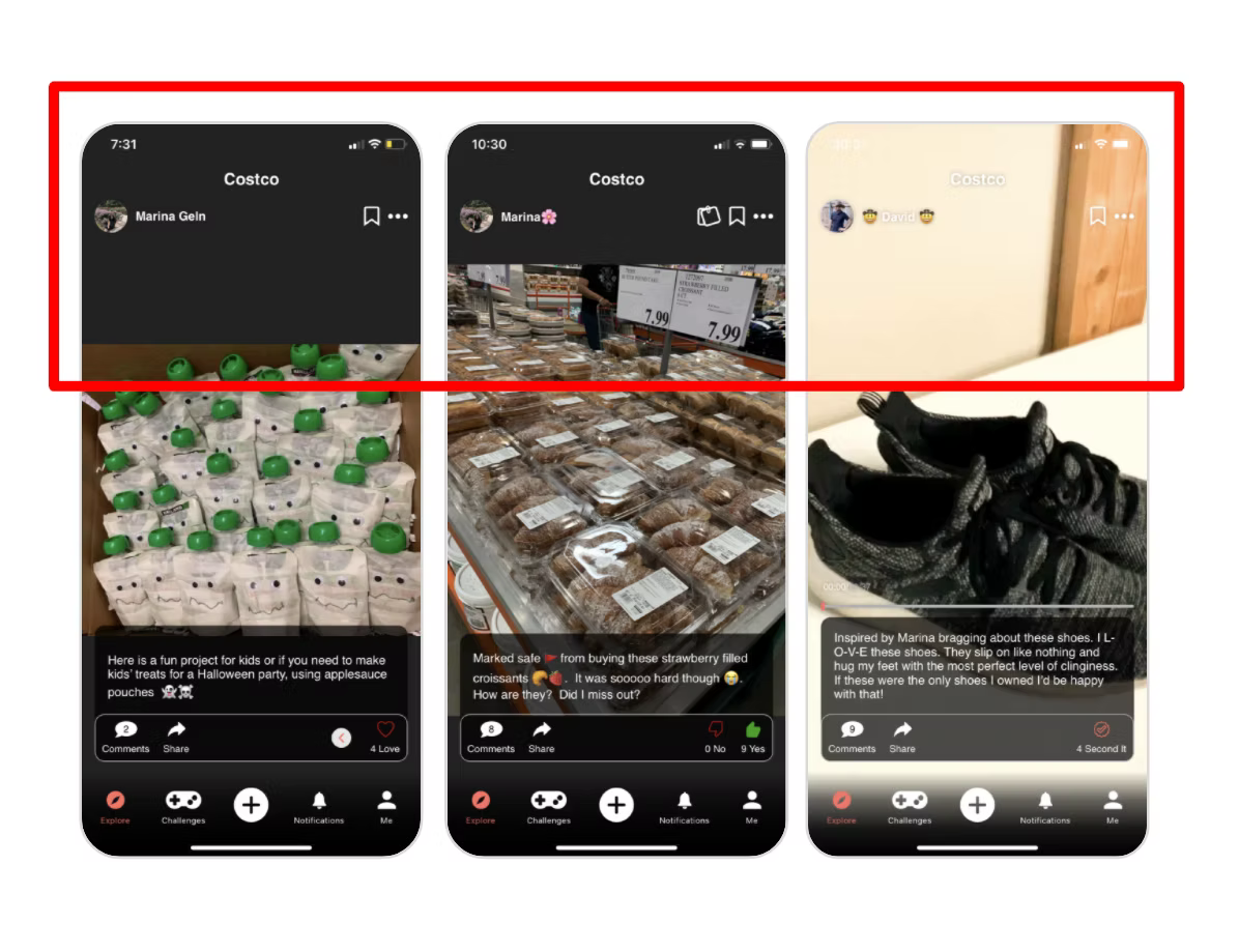
Iteration
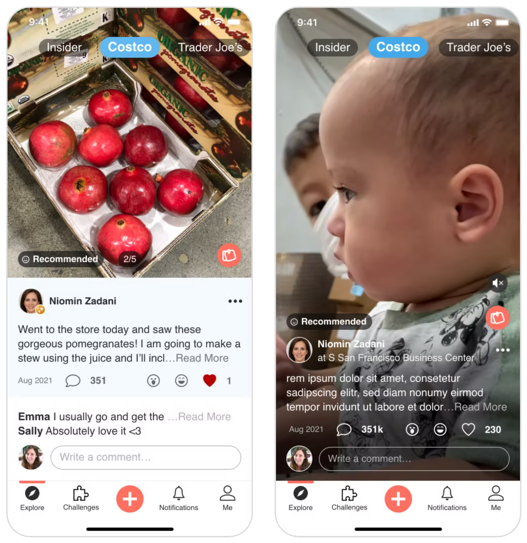
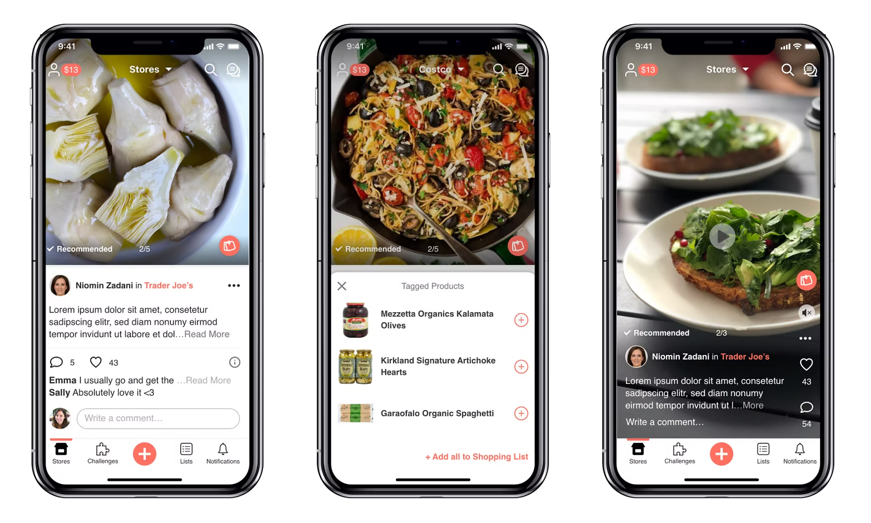
The findings translated directly into a redesign of the post — the atomic unit of the whole product.
What changed
- Fixed media size at the top for a unified look & feel and better use of space
- Full-size videos kept — users loved them, and they convey the story fast without words
- For multi-media posts the caption sits below the image; for video-only posts it's lowered onto a transparent background
- Post categories simplified and shown as a label on the post — Recommended, Disappointed, Need help!, Deals — so viewers get the gist at a glance
- Reactions simplified to Love, Laugh, Wow
- Latest comments displayed below the post to surface active conversations
- Comment input box placed right below the comments to encourage replies
Learnings & Next Steps
We continued user testing on the updated design, and overall our users were happy with the changes. A few key takeaways shaped what we considered for the next version.
Bringing all the key features back as part of the feed — and with the MVP validated by its founding community, the roadmap focused on growth, and on closing the loop from discovery to purchase.
Takeaways
- Our users really liked the search feature on Facebook groups
- Many showed interest in creating recipes to share with others
- With utility and entertainment features (Shopping List and Quiz) moved under Me, engagement on those dropped
What moved
- Hallway, Search and Me are on the top
- Stores are shown with a dropdown menu
- Shopping List and Recipes live under Lists on the bottom nav bar
- Current rewards are shown at the top next to Me
Takeaways
Startup design taught me the discipline of subtraction. The hardest calls were not what to design, but what to deliberately leave undesigned.
I'd also learned that a design system's first job at a startup is velocity, not consistency — a lesson I carried into enterprise work, where the opposite is often true.